SBV - the “Workday” of nursing facilities
my role
Product designer
timeline
4 months
status
Under-development
Overview
Similar to any corporation with employees, medical care facilities with nurses require an internal management system to keep the business running too. SBV currently works with over 700+ medical care facilities across the US.
After years of serving healthcare facilities with its software solution, SBV decided it was time for a change. An upgrade. Something that encompassed both a brand-new identity as well as an improved user experience to scale their reach more than ever before.
This redesign effort sought to benefit facility management, specifically those users who create schedules and manage employee shifts to keep the medical facility available 24/7.
TARGET USERS
Medical facility managers & supervisors
their task
Create shifts schedules for nurses to keep the facility running 24/7.
the problem
Tedious and error-prone scheduling caused understaffing issues
Good management is crucial in medical facilities to avoid scheduling mistakes that can affect patient care. Unfortunately, bad software can make these issues worse, even with schedules planned ahead.

"Scheduling just feels super rigid right now which is why I think we end up making some of these errors. There's definitely room for improvement."
SBV faced challenges redesigning their 20-year-old software while striving to close down their legacy app, prompting our involvement
SBV needed to update its outdated Windows 95 software to stay competitive and attract clients. They struggled with the overhaul on their own, so we stepped in to help.
Please note that the screens below are meant to illustrate the evolution from SBV's current to new solution. They are not contextually related.
B&A
Screens are not related; shot illustrates the design evolution between versions.
Overall, the experience of the redesigned software was still very archaic and had a lot of room for improvement.
Overall, the experience of the redesigned software was still very archaic and had a lot of room for improvement.
What’s keeping SBV archaic?
Considering how improving anything related to scheduling was not only the biggest user objective but also a stakeholder objective, let’s dive into what SBV was doing (or doing wrong).
When managers needed to figure out shift schedules, they had a hard time processing the information on screen
Considering how improving anything related to scheduling was not only the biggest user objective but also the stakeholder objective, let’s dive into what SBV was doing (or doing wrong).
IMG
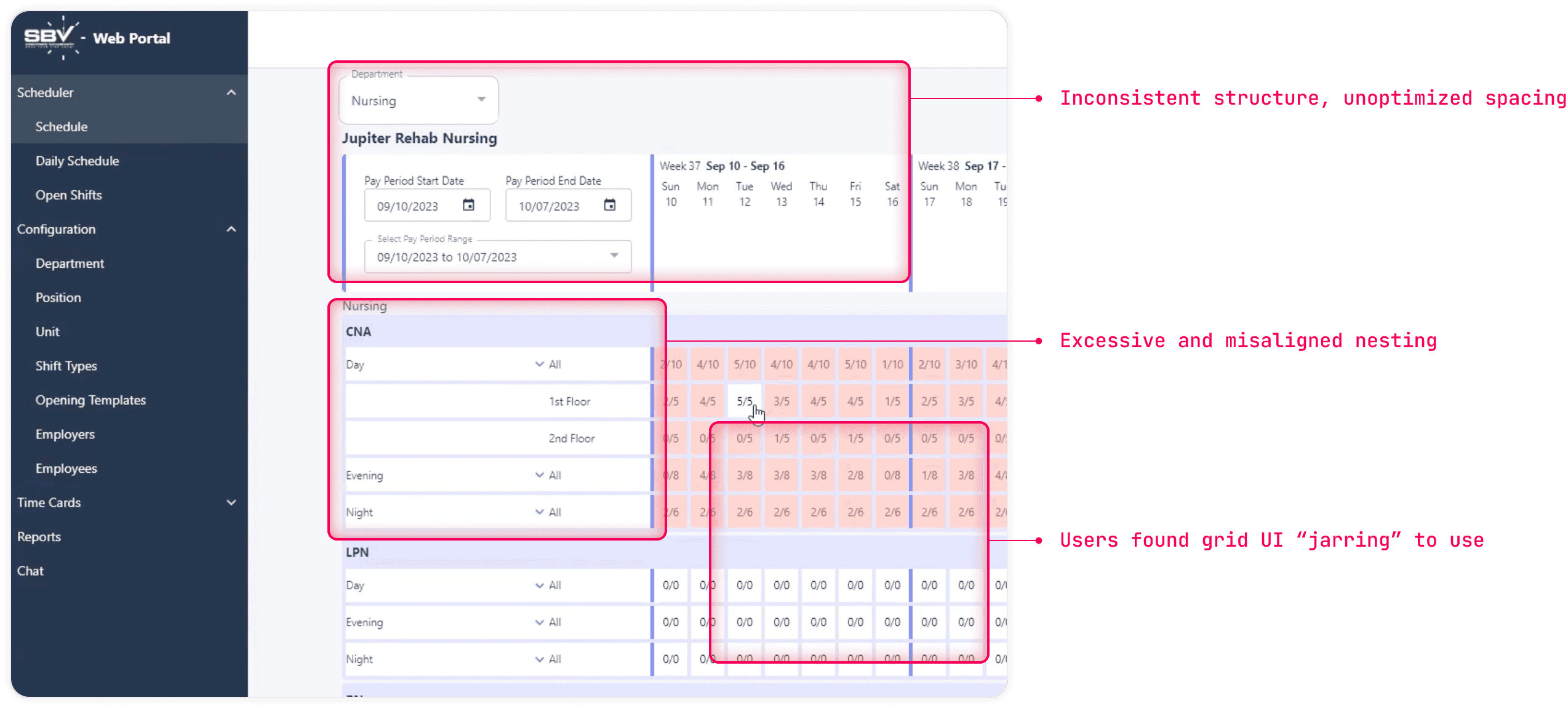
Issues in the schedule calendar
Rows of boxes and numbers that don’t make any contextual sense at a glance
No focal point or hierarchy, yet an excessive amount of nesting.
Handling scheduling tasks took more effort than it should have
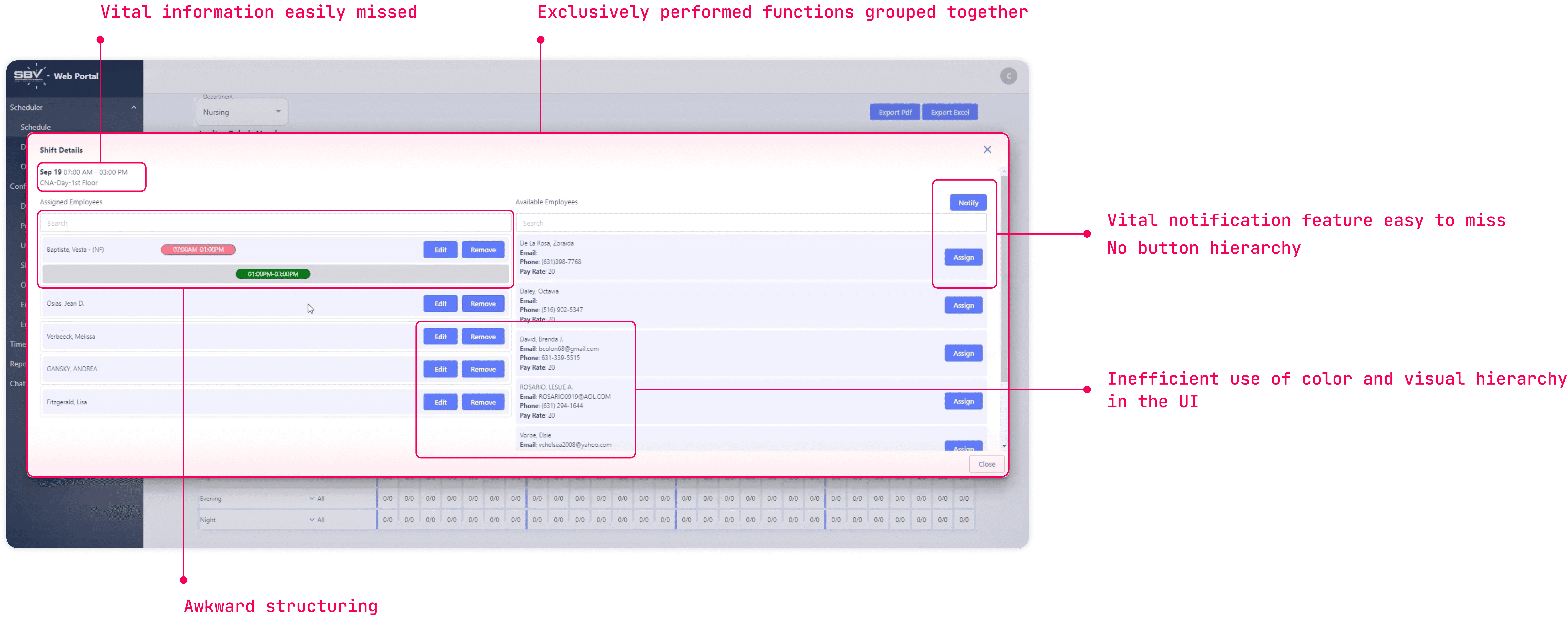
All scheduling actions were managed through a single modal containing numerous unrelated elements. While managers adapted to this setup over time, it still had room for improvement.
IMG
Issues in the shift actions modal
Visual hierarchy was all over the place & some vital information got lost
Additionally for managers, there was 5 completely unrelated features all crammed into a giant modal with no explanation, causing high cognitive load
No focal point
Utilizing the daily view for assigning shifts required more effort than necessary for managers
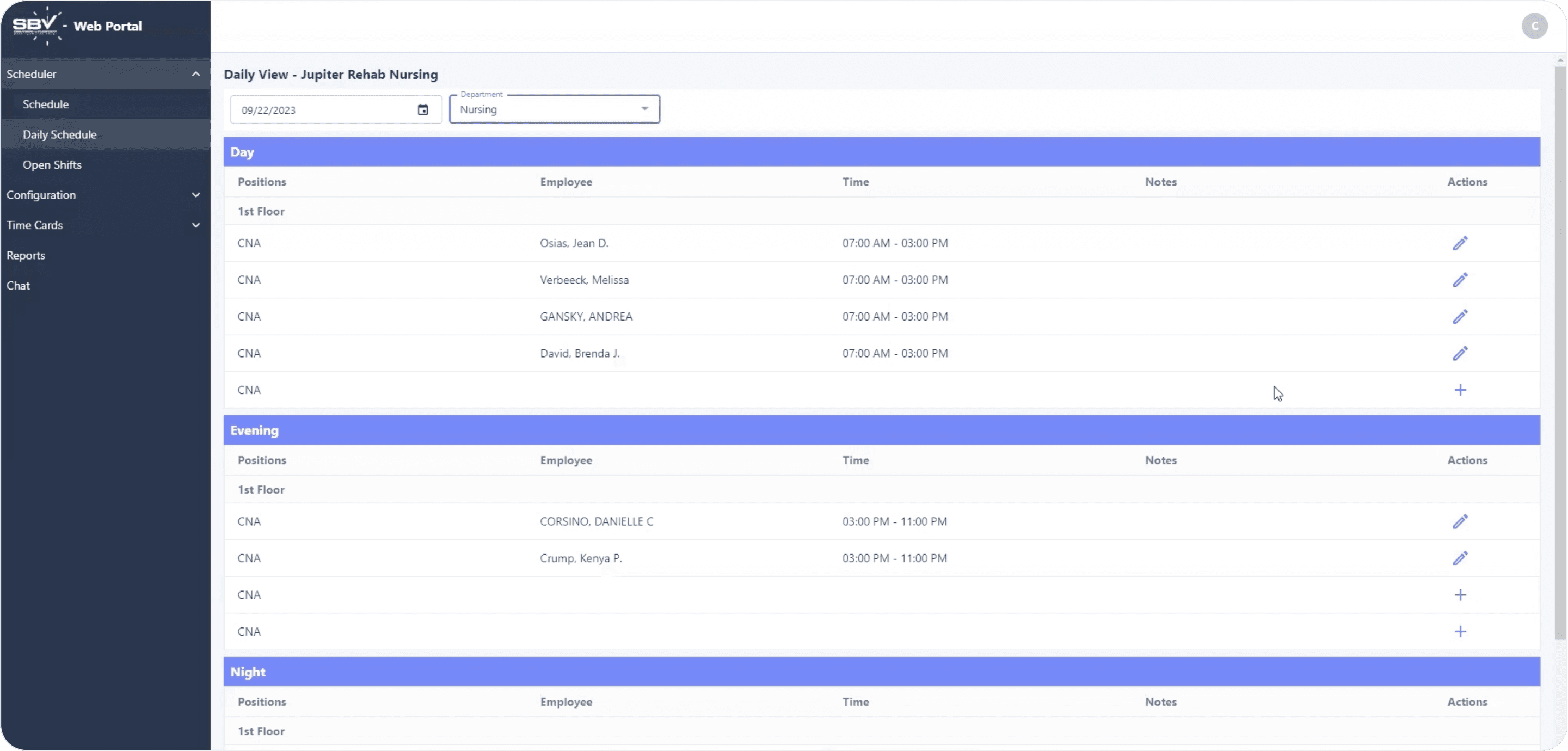
As shown, the daily view lacks basic design fundamentals, despite being a commonly used screen for managers to assess daily staffing.
IMG
The current daily view
The table format was not an effective way to display all assigned and unassigned shifts
The lack of color and hierarchy led to vital information being obscured and not easily noticeable
Lastly, the lack of micro-interactions and consistent visual hierarchies hindered managers' ability to scan information quickly
This lack of micro-interactions severely impacted managers' efficiency and unnecessarily increased their overall workload.

IMG
Current daily view and table
No variety in schedule/calendar views (day, week, month). Lack of a timeline view.
No filtering capability (by day shift, night shift, partial shift, unassigned shift, etc)
No sorting functionality to assist readability
rebirth of sbv
Let’s make sure the medical staff doesn't get in the way of nurses performing their real jobs - helping patients!
First, I'll review all the feature and experience changes we made to this module.
Streamlining scheduling workflows to cut down the time managers spend on routine tasks
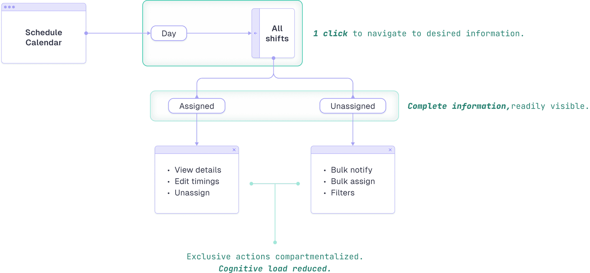
The current navigation architecture posed several issues for managers which I have highlighted below.
Show old flow
IMG
The schedule calendar flow
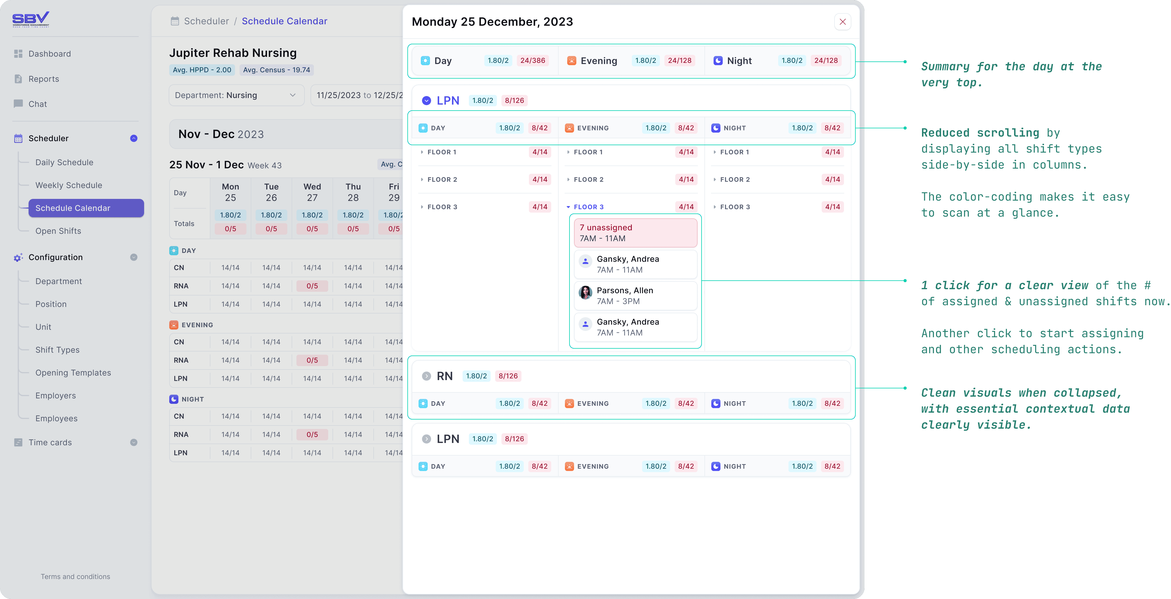
Managers need to see unassigned shifts right away in daily views, so we made sure they can
For the revamped daily view, we replaced the table layout with a columnar design, making the information easier to digest and use.
IMG
Daily view (quick slideout)
Providing different timeline views by adding daily and weekly in the side nav
Unassigned shifts are much more obvious now.
Using colors and distinct card designs to assist readability, like in shift types (Day, Evening, Night) and shift statuses..
Revamping the scheduling modal and adding new features to link with a planned mobile app that would allow nurses to control their own schedule
While working on this feature, we realized it needed to work with SBV’s upcoming mobile app (case study here), where nurses can request shifts. So, we added an 'Interested' status in addition to 'Available' and 'Notified.'
We also designed a bulk assignment feature so managers can now assign multiple nurses to the same time slot in one action, rather than repeating the process for each slot.

IMG
Improved schedule workflow
Important info such as timings, dates etc. is prominent and readily visible at the top
Added a new 'Interested' status for nurses and bulk assignment capabilities for shifts with the same time slot
Refined button and content hierarchy for a cleaner look and reduced visual clutter by hiding or removing unnecessary elements such as the partial shift indicators.
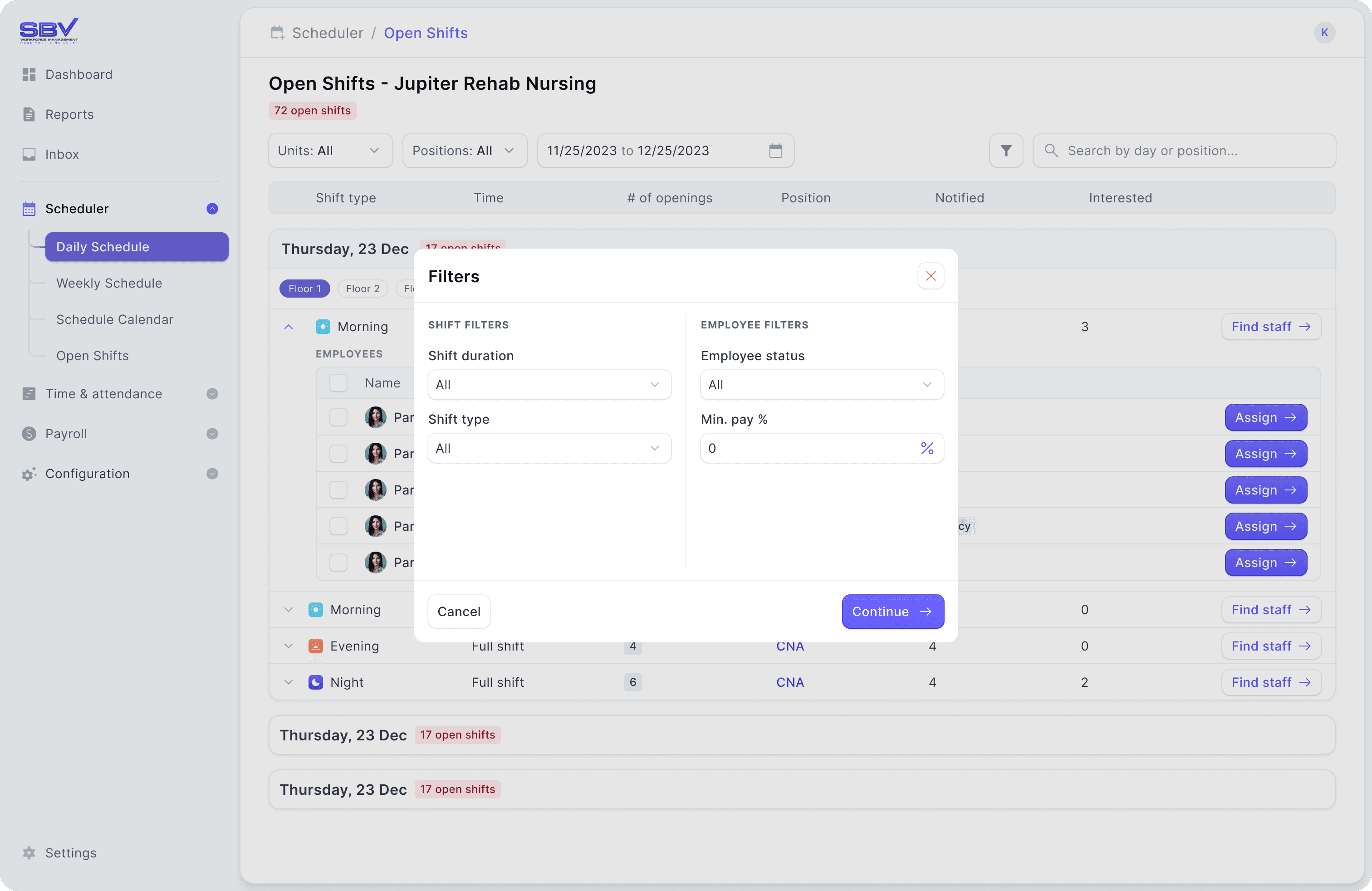
Adding filters, grouping, and sorting options to make situation-specific tasks for managers easier
We added straightforward filters and grouping options to each screen, helping users quickly remove unnecessary records while managing their routine tasks.
IMG
New filters for scheduling
Below is an example of how grouping options gave managers more flexibility in viewing shift schedules. Being able to filter by floor, shift type, and role provided a clearer picture of where understaffing was happening.
MP4
Changing views via grouping options
rebirth of sbv
Improving the UI side of things so managers can work easier and more efficiently
Now, I'll cover the visual, UI, and branding changes we made that affected the overall look and feel of the module.
Creating a strong visual language for managers to grasp context at a glance
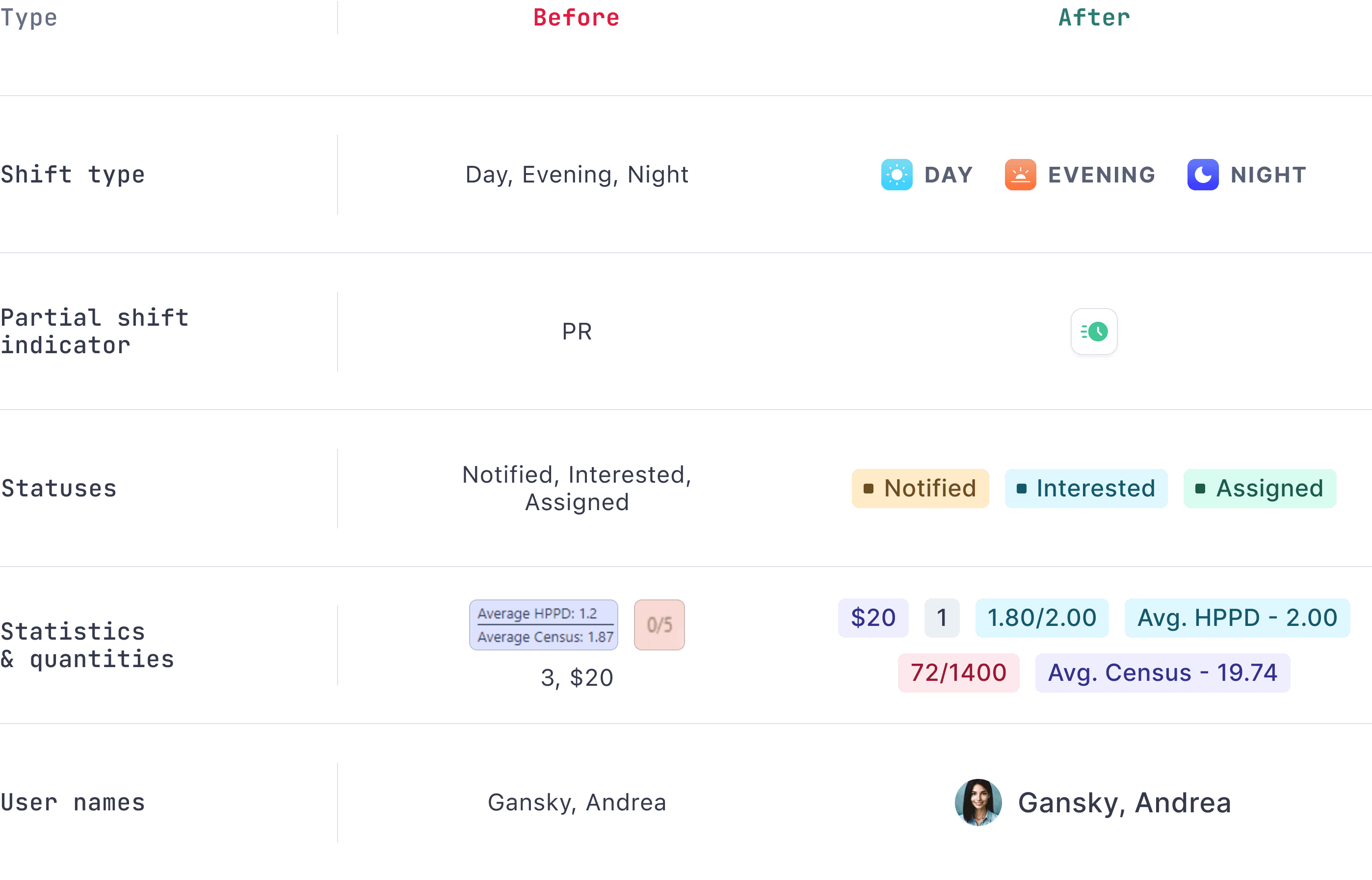
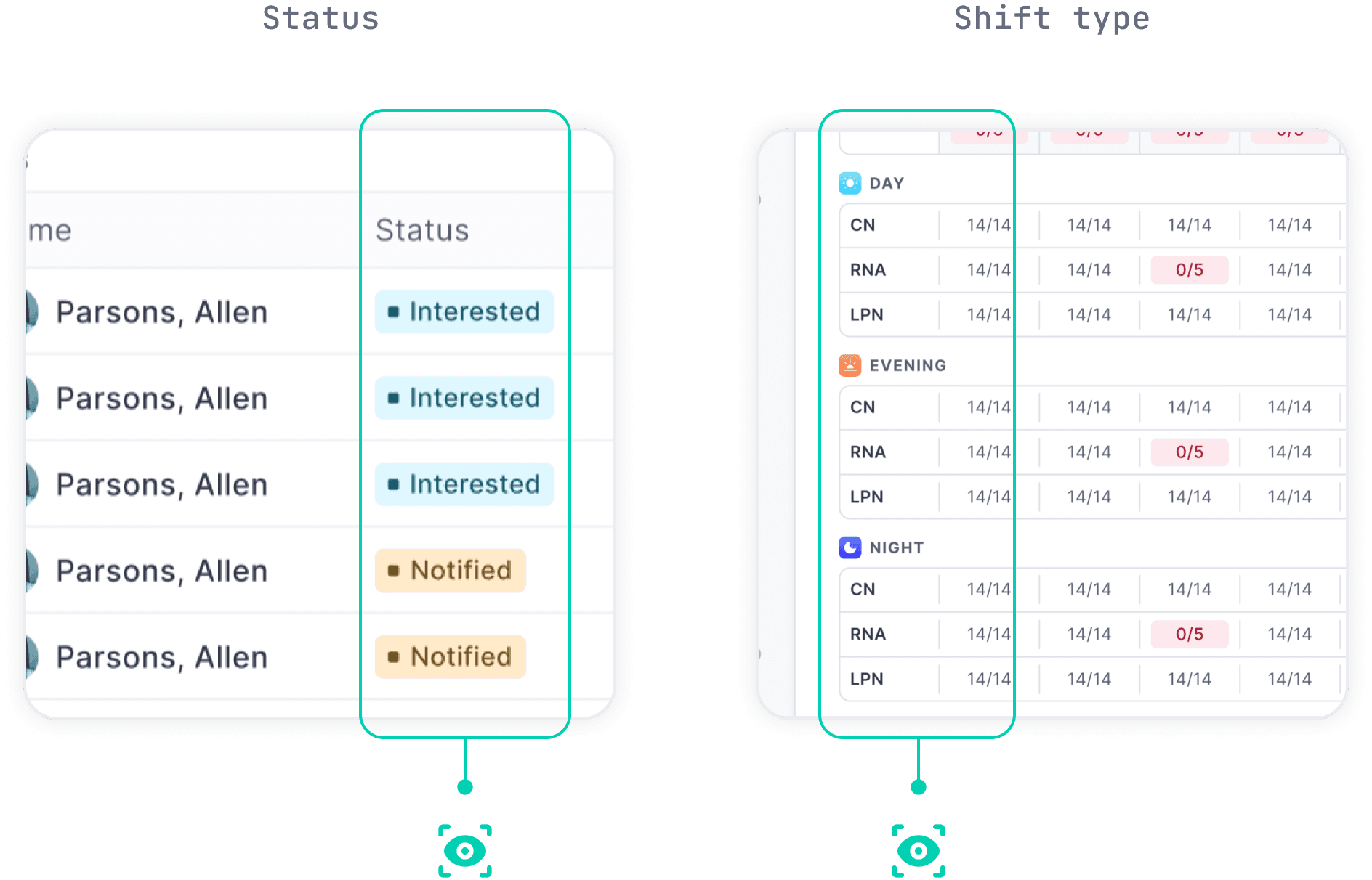
With the old SBV system, visual communication was almost nonexistent—everything was just text, from statuses to numbers and names.
To improve this, I introduced a visual language with colors and icons, so managers can quickly understand the information without having to read or search through the screen.
IMG
Comparing improvements made to the visual language
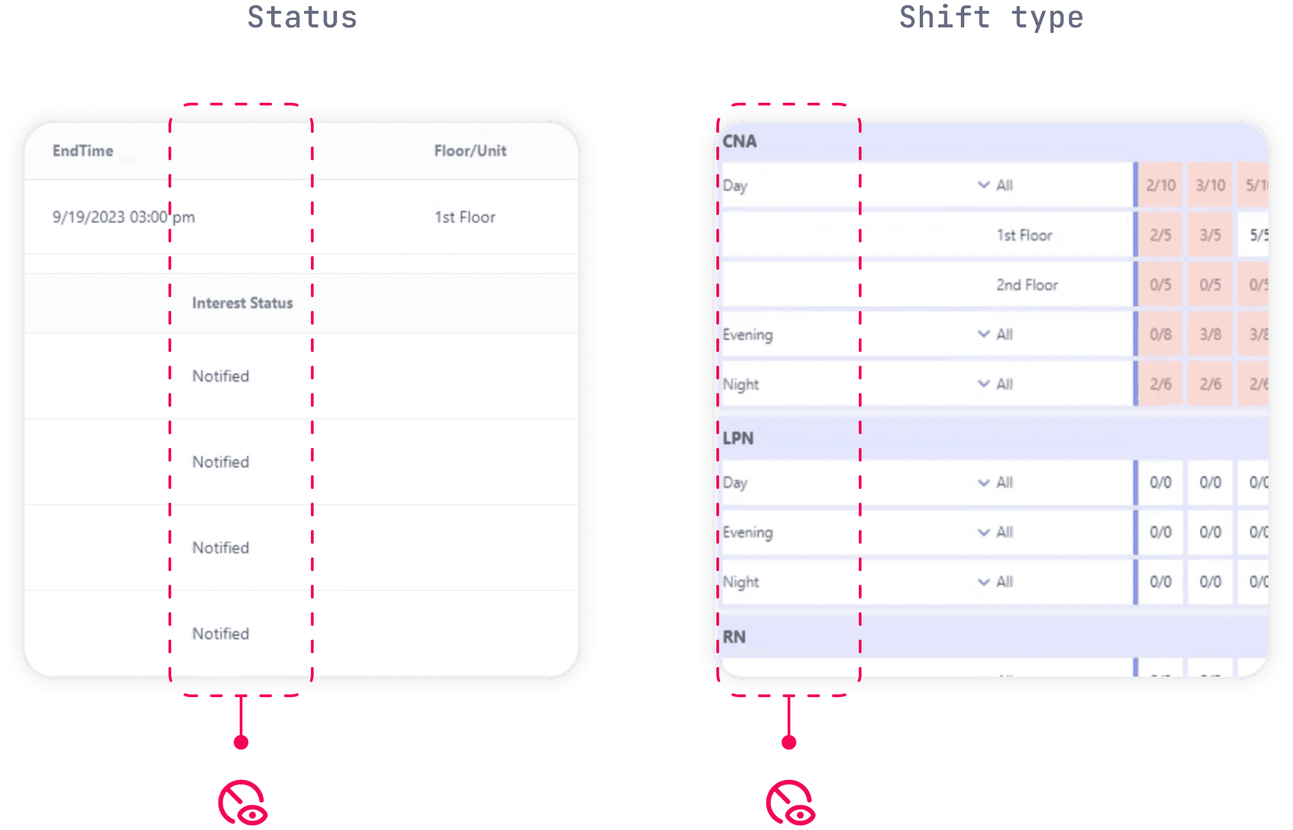
Here are examples of applications of this visual language.
IMG
Old state visual examples
IMG
Implementing our visual changes
a stark comparison
Here are some comparison shots showing the significant improvements we've made through our design efforts.
B&A
Overhauled schedule view
B&A
Overhauled scheduling modal
conclusion
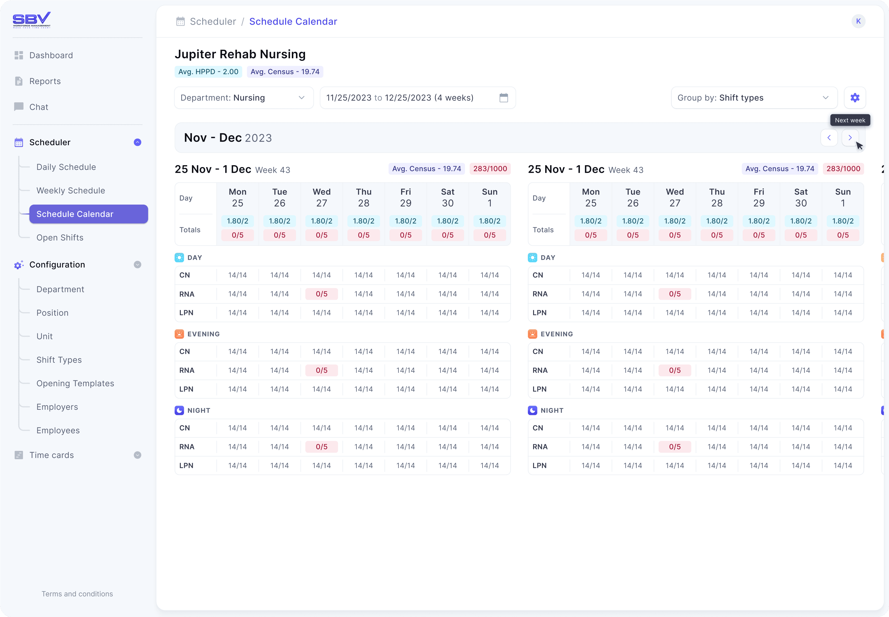
After 10s of meetings and design reviews, 100s of iterations & tests later, we settled upon a final product that we felt satisfied the needs of all the people involved.
Enjoy these shots of the final product :)
IMG
The gorgeous final schedule view
MP4
Navigating through the module
So what did we achieve?
A trusting relationship
Based on the work we delivered for their schedule app, SBV eagerly entrusted us with other projects that we are still collaborating on today.
A brand new identity
SBV was extremely pleased with the modern and tech-forward direction we took their brand in, which was beautifully reflected in the visual design of the app.
New & improved product
A fresh product that puts smiles on the faces of both users and stakeholders alike.